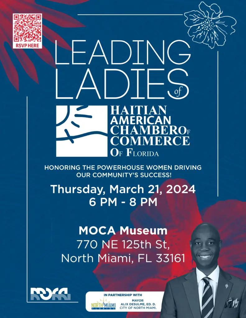
The color palette of this flyer is a standout feature that aligns seamlessly with the branding of the Haitian American Chamber of Commerce of Florida (HACCOF). The deep blue background serves as a solid, trustworthy base, evoking professionalism and reliability—key attributes that resonate with the essence of the chamber and the event itself. The choice of white for the main text ensures readability, providing a crisp contrast against the darker background. The strategic use of red accents, particularly in the floral motifs and QR code, introduces vibrancy and draws the eye to important interactive elements without overwhelming the viewer. This careful color selection reflects a balanced understanding of color theory, where contrast and harmony are well-executed to guide viewer engagement.
The layout of the flyer is meticulously structured, demonstrating a clear hierarchy of information that enhances the overall readability and user experience. The title, “Leading Ladies,” is the focal point, utilizing a large, bold typeface that immediately commands attention. The decision to center-align the title while placing other elements in a grid layout showcases an understanding of balance and symmetry. This approach ensures that the flyer remains visually engaging without becoming cluttered, maintaining a clean aesthetic that is both professional and inviting.
The use of negative space around the text blocks and images further contributes to the flyer’s readability, giving each section room to breathe. This is a crucial design principle, as it prevents the flyer from feeling congested and allows the viewer to absorb the information at a comfortable pace.
Readability is a critical aspect of any flyer, and in this design, it is handled with precision. The typeface chosen for the event details is modern and sans-serif, promoting clarity and ease of reading from a distance. The hierarchy is clearly defined: the event title is the most prominent, followed by the date and location, and finally, the partnership acknowledgments at the bottom. This ensures that viewers quickly grasp the most important information first, which is essential in event promotion materials.
The flyer also demonstrates a sensitivity to visual flow. The eye naturally moves from the bold title down through the event details and finally rests on the sponsor logos and the portrait, making the flyer intuitive to navigate.
The design sensibility displayed in this flyer aligns closely with the event’s purpose: celebrating the women who make HACCOF great. The floral elements add a touch of femininity and elegance, without detracting from the professional tone of the event. The decision to use abstract floral designs instead of more literal or ornate imagery reflects a modern, sophisticated approach that respects the event’s target audience—professional women and community leaders. This subtlety in design demonstrates an understanding of the event’s significance and the need to balance celebration with professionalism.
From a designer’s perspective, the overall quality of this flyer is high, reflecting a deep understanding of fundamental design principles. The integration of color, layout, typography, and imagery is cohesive, resulting in a flyer that is not only visually appealing but also functional and effective in its communication. The design speaks to the importance of the event, honors the women being celebrated, and effectively promotes the event to its intended audience.
In summary, this flyer is a well-executed piece of design that successfully communicates its message while maintaining a strong connection to the branding of HACCOF. It’s a fine example of how thoughtful design can elevate an event, making it more engaging and memorable for its audience.